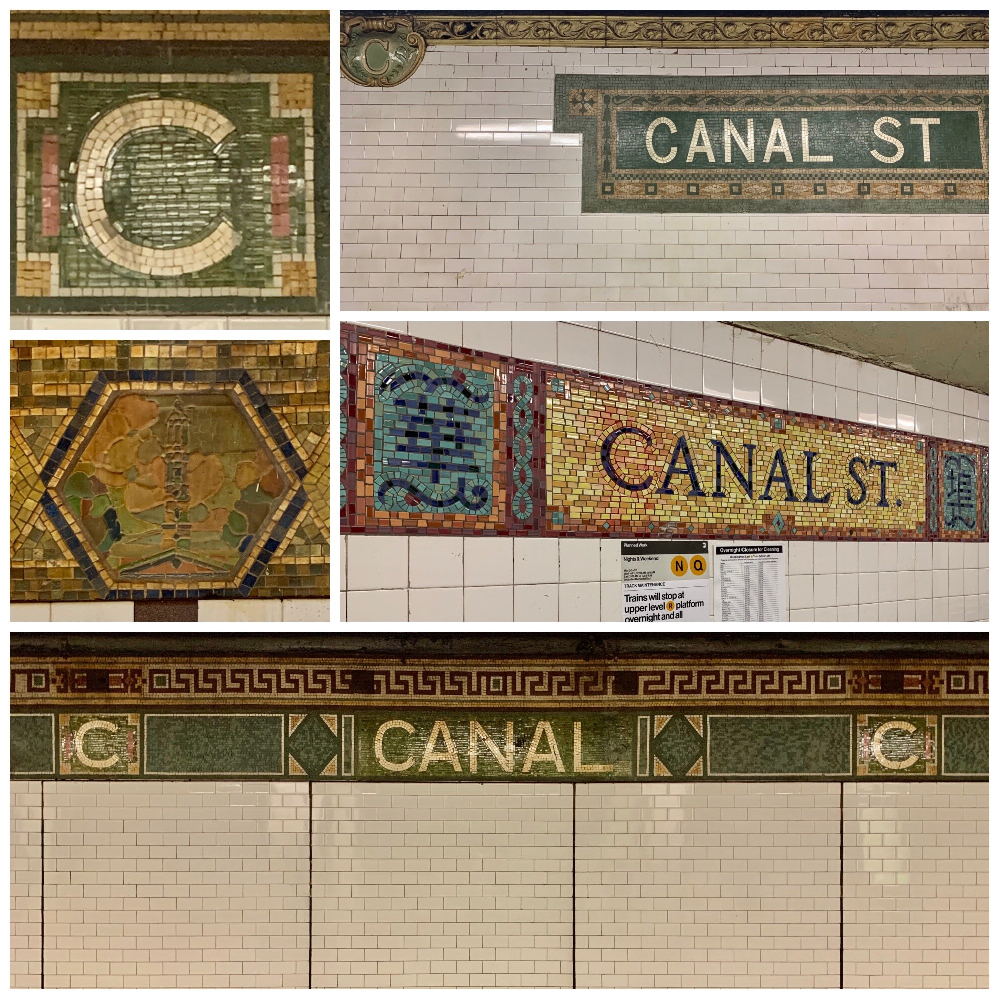
A collage of the various signage at Canal Street. Top left, a Squire Vickers’ “C”; next to it, a Heins & LaFarge cartouche offset by a Vickers mosaic. Below new mosaics done by Bing Lee read "Canal Street" in English or the Chinese characters for “Chinatown.” Middle left, a Heins & LaFarge terra cotta image of the spire of St. John’s Chapel told illiterate subway riders where they had landed.
Moving up the ORIGINAL 28 stations, CANAL has a stop on all lines.
Next stop on the Underground Art train: Canal Street. Canal has so many tunnels and stations, it’s easy to get lost, yet the labyrinth features art from original Heins & LaFarge Beaux Arts cartouches to the tiles of Bing Lee's Empress Voyage (1998).
After winning the competition for the Cathedral Church of St. John the Divine at Amsterdam Avenue and 112th Street, Christopher Heins and Grant LaFarge (Heins & LaFarge) who met at MIT became the super-star architects of the early 20th century. In the spring of 1900, Heins & LaFarge met the financier August Belmont, head of the consortium that was building New York's first underground mass transit system. They worked with designers and producers of ceramics, such as the Atlantic Terra Cotta Company at Canal Street, to make the subway both functional and beautiful. After Heins died in 1907, for both aesthetic and budgetary reasons, Squire Vickers — the subway’s longest-serving architect — pushed the subway onto a much more pared-down, modern path. Much of Vickers’s straightening and flattening had to do with the prevailing aesthetics of his day, as Arts and Crafts restraint gave way to just-the-facts decoration, sans-serif type and solid colors of the Independent subway in the 1930s.

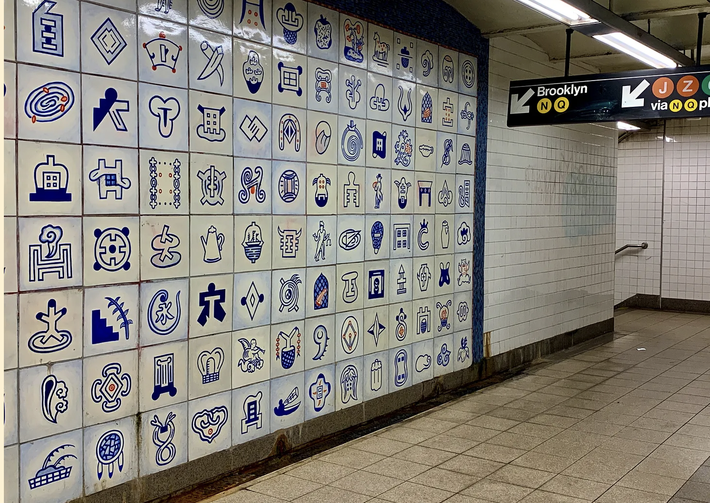
Interlocking teapots incorporate the Chinese symbol for “good life.”
Lee’s Empress Voyage commemorates the pioneering expedition of the American merchant ship Empress of China, which in 1794 returned to New York Harbor filled with silk, tea, and porcelain. On the platforms, interlocking teapots incorporate the Chinese symbol for “good life.” Other symbols, on the station's upper level, are variations on the symbols for “Asia,” “quality,” and “cycle.” As trains arrive, debarking passengers are given a choice of reading “Canal Street” in English or the Chinese characters for “Chinatown.” Lee was born in China and grew up in Hong Kong, and initiated an ongoing visual vocabulary project called “Pictodiary” in 1983. Since then, he has worked on a daily iconographic journal.

Teapots across the platform are the same teapots in jade and black.

Tiles on Bing Lee’s work Empress Voyage use Chinese-derived icons, illustrating aspects of the then-new trade with Asia and today's Chinatown.


A Heins & LaFarge cartouche offset by a Vickers’ mosaic.

As trains arrive, debarking passengers are given a choice of reading “Canal Street” in English or the Chinese characters for “Chinatown,” thanks to the artist Bing Lee.
